ShopDreamUp AI ArtDreamUp
Deviation Actions


Suggested Deviants


Suggested Collections


You Might Like…


Featured in Groups


Description
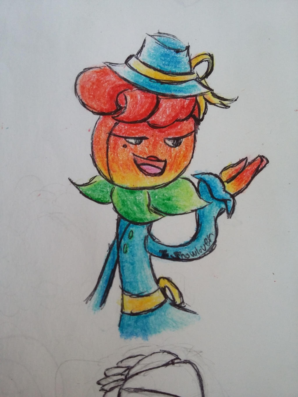
I decided to color this to practice using crayons.
original::origin()/pre00/8c52/th/pre/i/2017/173/6/2/a_wealthy_looking_rose_by_showlover-dbdlp3o.jpg)
original:
Image size
2448x3264px 2.08 MB
Make
SAMSUNG
Model
SM-G530H
Shutter Speed
1/30 second
Aperture
F/2.4
Focal Length
3 mm
ISO Speed
125
Date Taken
Sep 15, 2017, 2:00:44 PM
Comments38
Join the community to add your comment. Already a deviant? Log In
Personally, this is one of my favorite works that you've done.
The palette are especially well chosen: the yellow-green leaves leading down to the blue overcoat allows a smooth transition between colors, and without it, would have caused an awkward combination. (Blue hat on-top of the leaves and blue sleves against the petals are fine since they are in smaller amounts and aren't the center of attention) It would have been better if the buttons remained yellow and not green as the yellow accents in the clothing choices makes the green feel random and out of place.
For the face, I would advise that the inner mouth color should be much darker as it seemed light compared to the rest of her face- such a strong cascade of red to yellow makes the small shapes of different colors dull, so it would be better if you put in a bit more red and rouge for the mouth and red to the tongue to give them more strength/depth.
For the facial expression, the mouth is showing as pretty open. To make it seem more open, without having to make the mouth inhumanly wide, I'd have a small line curving over the tips of the smile (as I do in my drawings) to help illustrate that the corners of her mouth are going far enough hat they are hitting her cheeks.
For the arm raised upwards, the overlapping with her leaves seems askew- it would have been better to have the arm in front of her leaves, as having it behind and the position of her body implies that her arm is facing behind her back.
Personally, I thought it was very vigilant of you to use a darker hue of the used colors for shading since many artists make the mistake of only using black. Using black for shading extracts color in an unpleasing manor, as well it is less realistic to how colors in real life work. If I may suggest something, try adding small bits and hints of the color lower on the color wheel than the used color for shading (I.e. if something is yellow shade with a deeper yellow and a slight blend of orange, if something is blue shade with a deeper blue and a slight blend of purple, exc.). I am still experimenting with this myself.
All in all, great job!